Design Discussions: A Dive into Organic Modern and SoPoMo

Over the past decade in design we’ve seen and worked with a wide variety of aesthetic trends. As our practice evolves, we continue to push one another to explore and appreciate subtleties within a wide variety of interior design styles we find appealing as individuals. However, there are two styles in particular we’ve both developed a deeper appreciation for. We thought we would take the time to have a conversation on these two polar but trending styles, giving our thoughts on what draws us into them in particular.
Organic Modern


Lowe: I love this aesthetic for its versatility; organic modern prioritizes minimalism, clean lines and natural materials. For this reason they synergize well with other styles often found in remodel projects, like farmhouse or Scandinavian. The rigidity of architectural spaces formed by flat surfaces and rectilinear construction is often overshadowed by organic elements such as potted plants and dried arrangements in vases that provide and opportunity for natural forms and textures.
Hayward: You can take the classic measured forms of modernism and allow them to relax a little by using texture, organic shapes and earthy palettes to soften the sleek interiors. Unlike other more organic styles such as bohemian or Pueblo, the organic influences here get the same measured treatment that mid-century modern does, and so it feels at harmony with modernist forms. I love how it coalesces into an elevated & timeless look that still gets to enjoy the homeyness factor you get from styles like BoHo. It’s bright and inviting, and offers a good a canvas for creating moments of visual interest.


Lowe: The color palettes and materials lean on nature for their inspiration; greens found in plants, the beige-brown grains of woods and tanned leathers, the fuzzy white of cotton or rough orange of terracotta. I find it a very ‘honest’ aesthetic that is transparent in its simple materiality and where the human-made elements are venerated, such as woven jute rugs, handmade zellige tile or wrought metals. Organic and sometimes abstract forms exemplify the personal, crafted nature of the built environment.
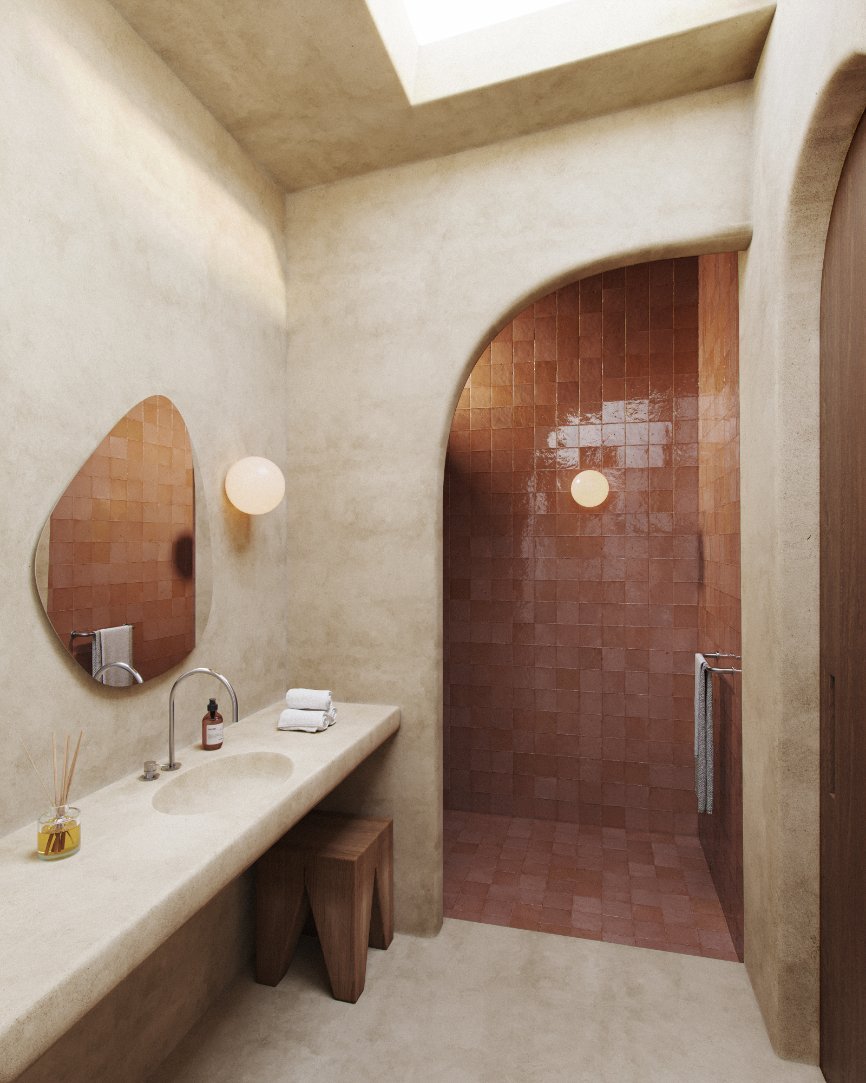
Hayward: Earth tones galore. I find this palette really enhances that grounding zen-like feeling of the space. It’s a return to nature by embracing the metaphorical ‘cave’, but a little more elevated. It’s not just about the browns though - bright reds, purples and greens really pop with this aesthetic and so leveraging those contrasting colors can give a space real character. One particularly fun element here is playing with asymmetry, something that can be expressed well through light fixtures or ceramics. It invites us to look for ways to break up that modernist aesthetic just enough.


Sophisticated Post-Modern (SoPoMo)

Lowe: In stark contrast, we coined the term ‘sophisticated post-modern’ (or SoPoMo), which celebrates industrial materials/ processes, artificial colors and geometry of the built environment. Like post-modern, this retro style is playful and bold but it uses the more sensible, orderly vernacular of modernist or bauhaus design. Pictured here is the Standard Hotel in London by Shawn Hausman Design; you can see more of the Standard Hotel in this article by Dezeen.
Hayward: I really love how playful this is, but I also love how it’s not trying to shout to the world how playful it is; it’s using restraint and doesn’t need to prove it to anyone. It’s that intersection of the two that is really interesting to me. I’d love to go to a fun cocktail party in a space designed with this look. Similar to organic modern there are lots of curves here too, but it’s expressed less in an organic manner and more with the graphic flair seen in bauhaus. The post-modern aspect of this style really shines through with just how much it plays with texture and sheen, it’s a wide open canvas. You get shiny, matte, cloth, carpeting, rugs, wall paneling, leather, even painted supergraphics or wallpaper; no surface is safe from being played with here. What creates cohesion is how the colors, composition and shapes are used to tie it all together tastefully, and that’s what brings this style an edge of sophistication.


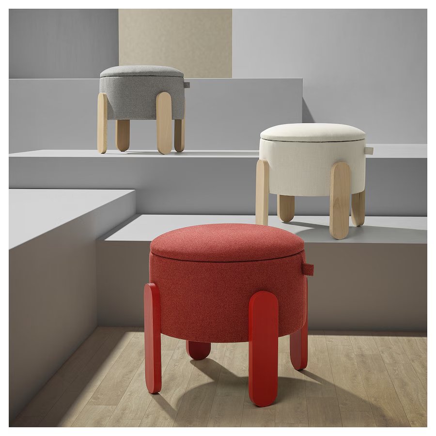
Lowe: Bold colors are used in a variety of materials, from plastics and highly polished unibody constructions to foams, powder-coated metal meshes and formica surfaces. We’ve not only seen IKEA recently release many items geared towards this SoPoMo aesthetic but many high-end furniture and lighting designers too, see the red Tom Dixon Bell table lamp to the bottom right. This exploration from higher end design studios shows that it isn’t just a younger, IKEA-buying generation that has an appetite for this design style, and we’re looking forward to exploring SoPoMo more in upcoming projects.
Hayward: Colors used while bold, often show restraint in their execution. It’s not trying to be pop art but still leaves room for pop. The overall image is tempered saturation and darker palettes, but then you use higher saturation elements for added vibrancy. The connection to IKEA’s recent furniture explorations is pretty interesting. I feel that in the same way that organic modern slots nicely in homes with a more farmhouse or traditional direction, SoPoMo can be great at spicing up scandi. While full dedication to the SoPoMo aesthetic is a bit adventurous for most homes, we can take inspiration with how it explores color, texture and shapes to apply it to other styles that will harmonize with it. It’s great at giving a special location like a library, bar or powder room a fun yet sophisticated edge in a remodel or new build.